In a European portfolio of over 400 projects, it’s the wind assets—not solar—that drive the diversity.
In the rush to quantify and manage uncertainty in renewable energy portfolios, a critical nuance is often overlooked: how individual assets interact from a statistical perspective. Industry-standard methods typically estimate portfolio risk by summing P-values—such as P75 or P90—across projects. But this approach assumes that all projects behave in lockstep, with perfectly correlated uncertainties. That’s rarely the case in reality. Wind and solar projects can differ dramatically in their production patterns due to geography, technology, and weather regimes. Ignoring these differences leads to overly conservative risk estimates and missed opportunities to optimize portfolio design. To unlock the true value of a diversified portfolio, we need to move beyond simple aggregation and instead quantify the degree to which resource variability across projects offsets itself. This is where portfolio benefit analysis comes in.
At Veer Renewables, we recently worked with a client operating over 400 wind and solar projects across Europe, producing more than one terawatt-hours (TWh) annually. Although the installed capacity was nearly evenly split between wind and solar (48% vs. 52% of P50 production), it was the wind assets that delivered the bulk of the portfolio’s diversity benefit.
Let’s dive into how we got that result.
Because many of the projects were small (< 10 MW), each would contribute negligibly to the portfolio benefit, regardless of their relative diversity. Therefore, we grouped assets into clusters by enforcing a 0.90 R² correlation in annual resource within each group. ERA5 reanalysis data for wind speed and solar radiation from 1980 through 2024 were used to produce these correlations. This reduced over 400 assets into 59 clusters (Figure 1), each with a range of assets and total P50 production.
The results were revealing.
Clusters varied widely—from a single project to more than 40.
Most clusters had P50s under 200 GWh, though three exceeded 1,000 GWh.
Figure 1: Asset cluster statistics show that clusters can have over 40 assets or sometimes just one. We also see a large range of P50 values, with 3 clusters exceeding 1000 GWh.
Looking at correlation in annual resource across clusters (Figure 2), we see a wide range of R² correlation values between -0.5 and 1.0. The mean R² across all clusters was just 0.14, highlighting strong diversity in this European wind and solar portfolio.
Figure 2: R² correlations across asset clusters.
To quantify this portfolio benefit—the reduction in uncertainty that results from annual resource diversity across clusters—we implemented a Monte Carlo simulation framework. We sampled from each cluster’s P50-based annual production distribution one million times, carefully preserving the inter-cluster correlation structure using a covariance matrix derived from historical resource variability. This ensured that each simulated year realistically reflected co-variability between clusters.
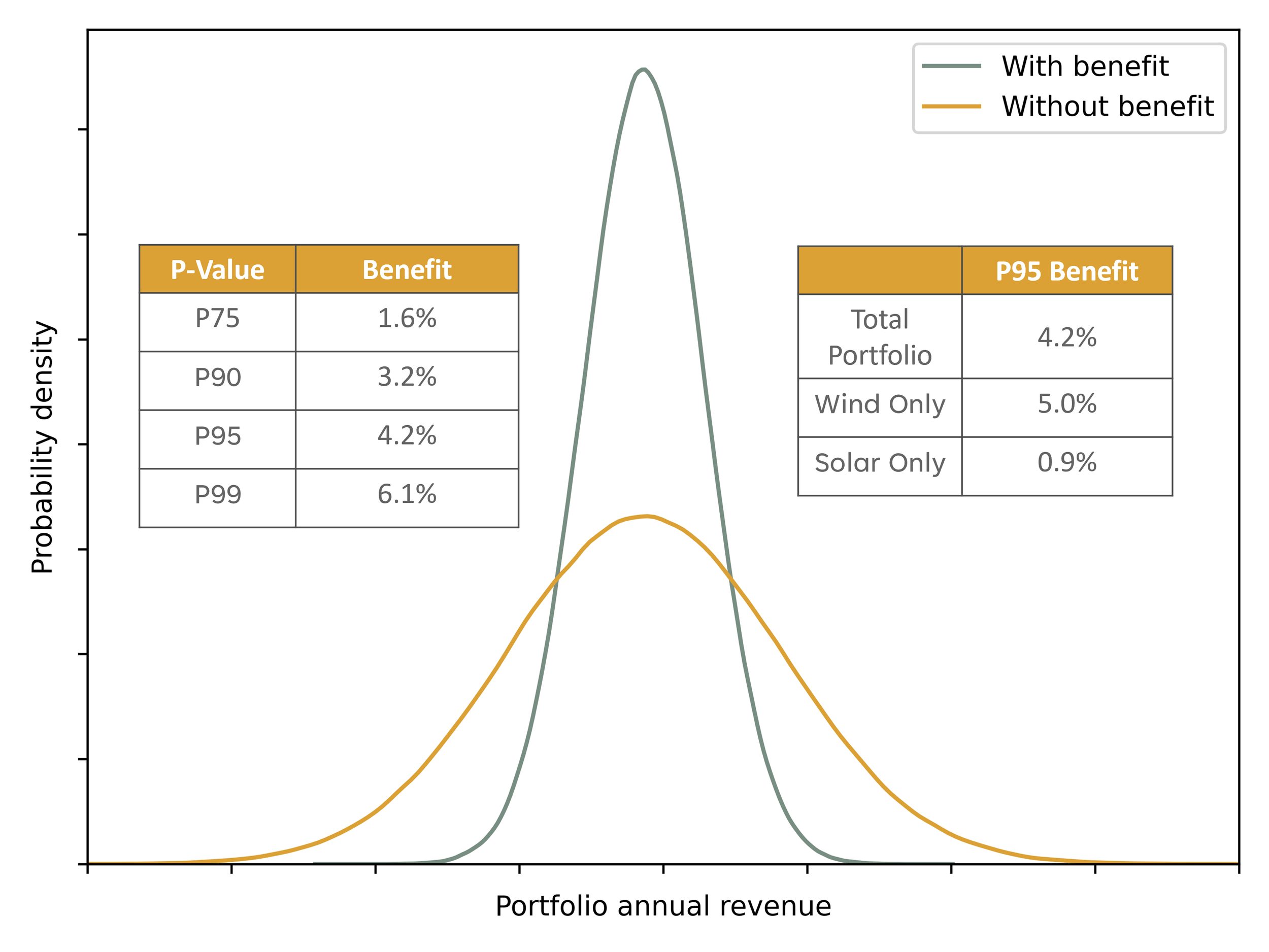
Annual production values were then converted to revenue using country-level price statistics, allowing us to assess uncertainty in financial terms. By comparing the distribution of summed P-values (which assume perfect correlation) with the Monte Carlo-based distribution (which respects actual correlation), we isolate the portfolio benefit: a measurable tightening of the uncertainty bounds driven by real-world statistical independence between assets (Figure 3).
The results were compelling. We observed a 4.2% improvement in the portfolio-wide P95 revenue—a significant reduction in downside risk.
Figure 3: Substantial tightening of annual portfolio revenue due to strong inter-asset diversity.
Interestingly, when we repeated the analysis separately for wind-only and solar-only clusters, the difference became more apparent. The wind-only portfolio showed a 5.0% improvement at P95, while the solar-only portfolio saw just a 0.9% improvement. At first glance, this might seem counterintuitive—shouldn’t combining technologies increase diversity?
It does—but context matters. In this portfolio, wind and solar were nearly evenly split by energy contribution (48% wind, 52% solar by P50). Adding solar increased the total energy-based benefit (in absolute TWh terms), but because solar made up a large share of the now larger portfolio, the relative percentage benefit appeared smaller.
The reason is simple: solar resource across Europe is highly correlated, offering limited spatial diversity. Wind, by contrast, exhibits much greater spatial variability. This means each wind cluster contributes more uniquely to the overall portfolio smoothing effect, making wind a stronger driver of diversification—on both a per-cluster and per-megawatt basis.
We see this in Figure 4, where each cluster is ranked in terms of its contribution to the portfolio benefit (calculated by re-running the Monte Carlo analysis, holding out one cluster at a time, and computing the relative change in benefit). Only a handful of clusters were responsible for most of this benefit—and they were wind-dominated. Wind’s stronger spatial and temporal resource variability gave it a key advantage in driving diversification, while solar assets tended to move together more consistently.
Figure 4: Contributions of wind-based and solar-based clusters to the portfolio benefit.
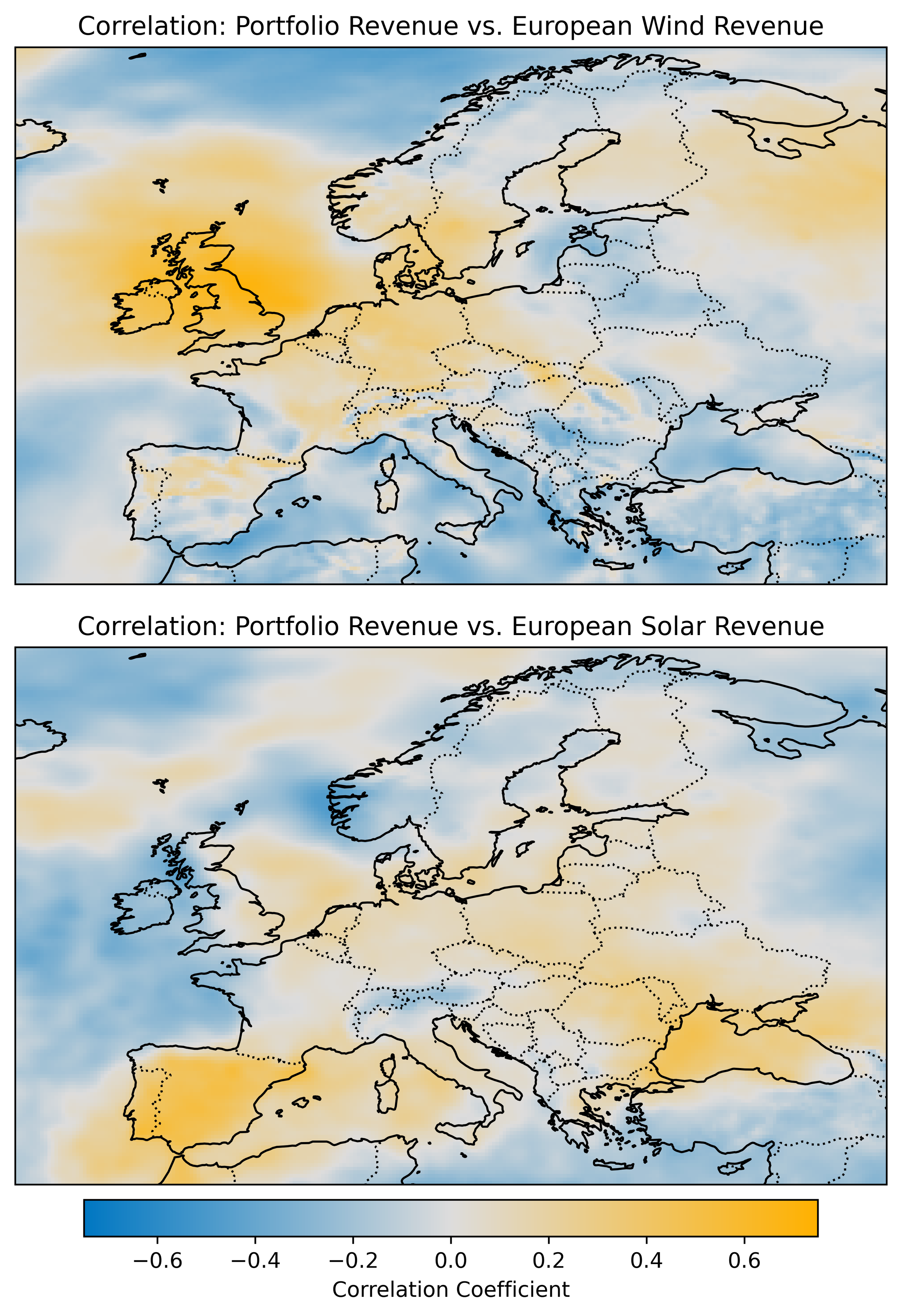
Finally, to support the client’s future planning, we also developed correlation maps comparing each region’s gross annual wind and solar output to overall portfolio revenue (Figure 5). What we want are blue regions—areas whose resource is negatively correlated to the portfolio’s current production and revenue. Similarly, we want to avoid the yellow regions which will not meaningfully add to the portfolio’s diversity.
Figure 5: Correlation maps of annual portfolio revenue and regional wind and solar resources.
Of course, correlation alone isn’t enough. A site still needs a strong enough resource to support a financially viable project. The best diversification opportunities lie at the intersection of high-quality resource and low correlation with the rest of the portfolio.
It’s also important to note that our analysis focused solely on annual resource variability—a major driver of production uncertainty, but not the only one. Other factors like availability, curtailment, and performance losses also contribute to deviations from expected energy output. In principle, the correlations between these additional uncertainties—across technologies, regions, or operators—can also be quantified and incorporated into portfolio models. However, the data to support that analysis is often less robust and more site-specific than what’s available for resource variability.
Still, this case study underscores the value of quantifying what we know best: resource-driven diversity. By doing so, portfolio owners can better understand their exposure, reduce uncertainty, and make smarter decisions about where—and what—to build next.


